This week Adobe released some browser share stats. I saw the graph and saved the article, thinking it was tweetworthy. The big news was Chrome/Android passing IE for browsing dominance. And I agree, that’s newsworthy. But as I thought about my precious 140 characters and the message that was useful to convey, I realized there was a more-than-140-characters story to tell.
So here’s my muse…

And here’s the thinking she inspired in me today…
When we see a graph like this a typical response is “those idiots at Microsoft were fools for not seeing this and doing something about it. Big companies can’t innovate…sigh.” Let me leave the big company bashing and answer why Microsoft didn’t see this. It was because of how they (the browser team) defined themselves. They were likely looking at graphs like this one:
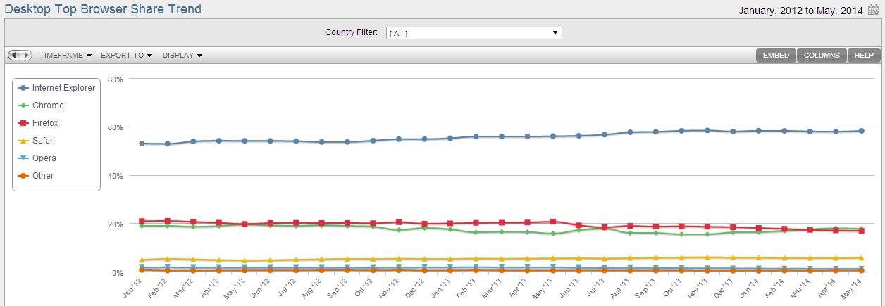
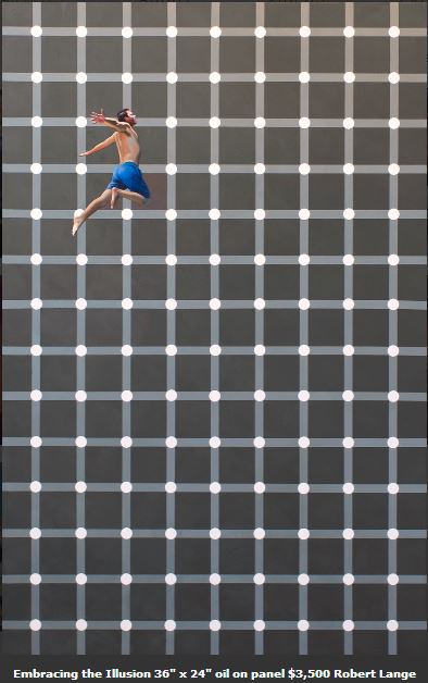
See that IE share is growing? Does that surprise you, especially when you look at the overall graph then this one? Stats can easily mislead us, especially when we want to believe something. Stats can play tricks on our brain. I’m reminded of an awesome painting I saw this weekend at Robert Lange Studios: Embracing the Illusion
An illusion can be subtle. I won’t belabor this point further; I know you all are smart and get it.
The question is how do we combat it? It is so easy to get caught in our illusions — big company, start up, new product, old product, and even in how we define ourselves. How do we not lie to ourselves and become the fabled boiled frog?
I vote for Simon Sinek’s Golden Circle from Start with Why. What if, for example, the Internet Explorer team started with the why of “we ensure people find what’s interesting to them wherever, whenever”, not starting with their “what” of “we are a browser for the internet”?
Apple did not define themselves as a computer company. If they did, would they ever have come up with the iPod, which led to the iPhone and then the iPad.
Once the IE team started with the idea of ensuring people find what is interesting to them, they might think about how people define what’s interesting to them. Many people view that as recommendations from a friend. And that might have led them to this study from ShareThis that shows that the mobile web is 2x more social than the desktop web. Wow, if I am in a market where I find a channel with 2x the leverage of my traditional channel — note desktop just becomes a channel for interesting stuff versus the product — I’m going to take it!
So now you know how I spent my Sunday… by the pool thinking about how we all limit ourselves, and what are the ways of overcoming that. Inspired by another of Robert Lange’s paintings, my shirt today says:
Aspiring to be,
free from illusions
